Why Your Current Website Isn’t Converting
Why Your Current Website Isn’t Converting
A website can look good and still not work.
That is one of the biggest things I see with service business websites. The design might be clean. The photos might be nice. The colors might feel polished. But when someone lands on the site, they still do not understand what the business offers, who it is for, why they should trust it, or what to do next.
That is where conversion breaks down.
Most of the time, the issue is not one single thing. It is a combination of unclear messaging, outdated design, confusing structure, cluttered pages, and too many calls to action pulling people in different directions.
And when people feel confused, they usually leave.
01/ Conversion Starts With Clarity
A website does not convert just because it looks professional. It converts when the visitor can quickly understand:
What you do
Who you work with
Why it matters
Why they should trust you
What step to take next
That sounds simple, but a lot of websites miss it.
Many service businesses are so close to what they do that they forget what a new visitor needs to know first. They explain things from the inside of the business instead of from the client’s point of view.
The result is a website that may feel complete to the business owner, but unclear to the person trying to make a decision.
02/ The Offer Is Not Clear Enough
One of the most common conversion problems is an unclear offer.
A visitor should not have to dig through your website to understand what you actually provide. They should know very quickly what service you offer, who it is for, and what kind of result or experience they can expect.
If your offer is vague, people will not take the time to figure it out.
This is especially important for service based businesses because people are not just buying a product. They are choosing a person, a process, and an experience. They want to know they are in the right place before they reach out.
A clear offer creates confidence. A confusing offer creates hesitation.
03/ Your Website May Be Outdated Without You Realizing It
Outdated does not always mean old.
A website can be visually outdated, but it can also be strategically outdated. Your business may have grown, your services may have changed, or your ideal client may be different from when the site was first built.
That means your website might be showing an older version of your business.
This matters because people make fast judgments online. If your site feels behind, unclear, or disconnected from the level of work you actually do, it can weaken trust before someone ever contacts you.
You may be better than your website suggests.
That gap is where a lot of lost inquiries happen.
I saw this clearly in a therapist website redesign where the old site no longer reflected the depth, warmth, or credibility of the practice.
04/ Confusing CTAs Make People Pause
One of my strongest opinions about calls to action is this: make the next step clear.
Too many options confuse people.
When every section has a different button, the visitor has to stop and think. Should they book a call? Fill out a form? Email you? Read more? Download something? View pricing? Go to another page?
That moment of hesitation matters.
A strong website should give people the simplest way to get in touch. For most service businesses, that means having one clear primary CTA and using it consistently across the site.
The goal is not to force someone into action. The goal is to make the next step feel obvious.
05/ Design Should Guide the Eye
Good design is not just about making something look nice. It is about guiding attention.
A lot of websites struggle because the page does not have a clear visual path. Everything competes for attention. The headline, images, buttons, icons, paragraphs, and sections all feel equally important.
When that happens, the visitor does not know where to look first.
Design should lead people through the page naturally. The eye should move from the main message to the supporting details to the next step without effort.
That requires strategy. It also requires knowing your audience.
If you do not understand what your target audience needs to see, feel, and understand before they reach out, the design will not guide them in the right direction.
This is also why my background in interior architecture and graphic design shapes the way I approach websites: a good page should guide people naturally without making them work for it.
06/ Your Website Might Not Be Speaking to the Right Person
Another reason websites do not convert is that they are not built around a clear target audience.
When you try to speak to everyone, your message usually becomes too general. It may sound nice, but it does not make the right person feel seen.
A strong website should answer the quiet questions your ideal client is already asking:
Is this for me?
Do they understand what I need?
Can I trust them?
Do they have experience with this?
What happens if I reach out?
Will this be easy or overwhelming?
When those questions are answered clearly, people feel more comfortable taking the next step.
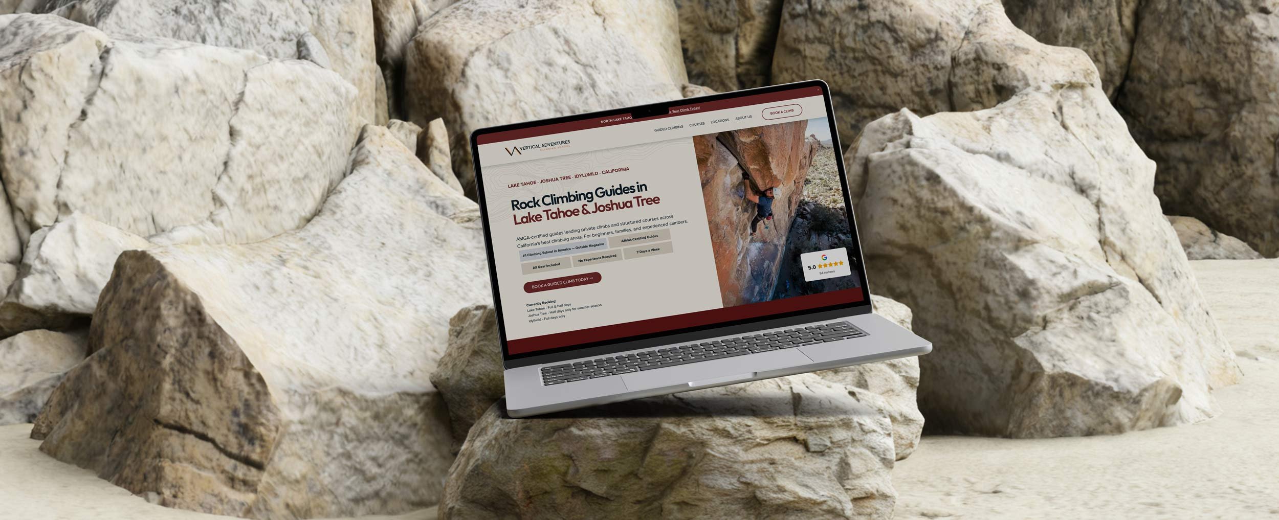
Case Study: Vertical Adventures
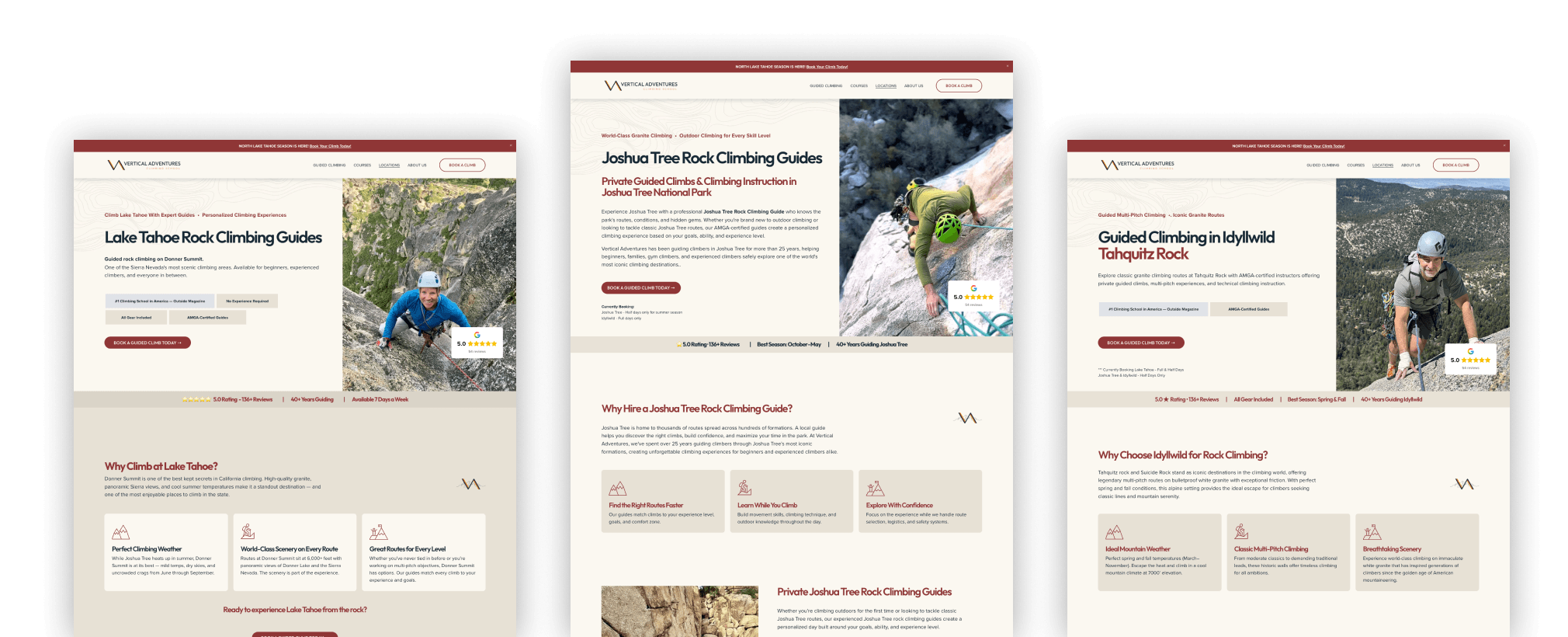
One example of this was a climbing guide website I worked on for Vertical Adventures.
The issue was not that they lacked great services. They had strong offerings, experienced guides, climbing courses, and multiple locations. The problem was that the courses and locations were not listed out in a way that made the experience easy to understand.
For a business like rock climbing, clarity is especially important.
Climbing can feel intimidating. It involves real risk. People need to feel informed and comfortable before they book or reach out. They want to know what options are available, where they can climb, what level the experience is for, and whether they will be guided safely.
We worked on making the booking options easier to understand, organizing the courses and locations more clearly, and giving visitors enough information to feel confident.
That is what conversion actually looks like.
It is not just making a page prettier. It is making the decision easier.
07/ Trust Has to Be Built Before the Inquiry
Most people will not reach out just because you have a contact button.
They need to feel ready.
That is why trust has to be built throughout the website, not only at the end. Your site should help people feel like they understand your process, your expertise, your style, and what it would be like to work with you.
Trust can come from:
Clear service descriptions
Specific examples
Strong testimonials
A simple process
Professional design
Helpful information
Clear next steps
For service businesses, trust is one of the biggest parts of conversion. People are not just asking, “Can this person do the work?” They are also asking, “Do I feel comfortable starting a conversation with them?”
08/ Clutter Makes the Decision Harder
Clutter is another common reason websites do not convert.
Too much text, too many sections, too many buttons, too many competing messages, and too many design elements can make a site feel overwhelming.
A cluttered website does not feel more informative. It usually feels harder to use.
People need enough information to make a decision, but they do not need everything all at once. The job of the page is to organize the information in the right order.
Start with what matters most. Then support it. Then guide the visitor forward.
That is how a website becomes easier to move through.
09/ Conversion Is Not About Being Pushy
A lot of business owners think conversion means being salesy, aggressive, or constantly pushing people to take action.
I do not see it that way.
Conversion is not about being pushy. It is about clarity, trust, timing, and making the next step feel easy.
A good website respects how people make decisions. It gives them the information they need in the right order. It removes confusion. It builds confidence. It makes reaching out feel natural instead of forced.
That is the difference between a website that simply exists and a website that actually supports your business.
10/ Signs Your Website May Not Be Converting
Your website may need a closer look if:
People visit your site but do not inquire
You get questions your website should already answer
Your services are hard to explain quickly
Your calls to action feel scattered or inconsistent
Your site feels outdated compared to the quality of your work
Visitors do not know where to go next
Your pages feel cluttered or hard to follow
You are attracting the wrong type of inquiry
You feel like your business has outgrown the site
These are not small details. They affect whether someone feels confident enough to take the next step.
What to Fix First
Before you change colors, swap fonts, or rebuild random sections, it is worth looking at whether your site needs a more strategic web design approach built around clarity, trust, and conversion.
Start with the strategy.
Ask yourself:
Is my offer clear?
Is my audience clear?
Is the page easy to follow?
Is there one clear next step?
Does the site build trust before asking for action?
Does the design guide the eye?
Does the website reflect the level of my business now?
Once those pieces are clear, the design has something to support.
That is when a website starts working better.
Your Website Should Make the Decision Easier
Your website does not need to say everything.
It needs to say the right things clearly.
If your website feels unclear, outdated, or harder to explain than it should be, start by sharing where your business is now and what is not working.