5 Sections Every Service-Business Homepage Needs
Your homepage does not need to explain everything about your business. It does need to help the right person quickly understand what you do, recognize that you can help, trust what they are seeing, and know where to go next.
That sounds simple, but it is where a lot of service business websites start to fall apart. The homepage may look polished, the photography may be beautiful, and the branding may feel professional. But if someone has to work to understand what you offer or figure out what they should click, the website is creating friction instead of removing it.
A strong homepage gives people a clear path through your business. For most service businesses, that path comes down to five essential sections.
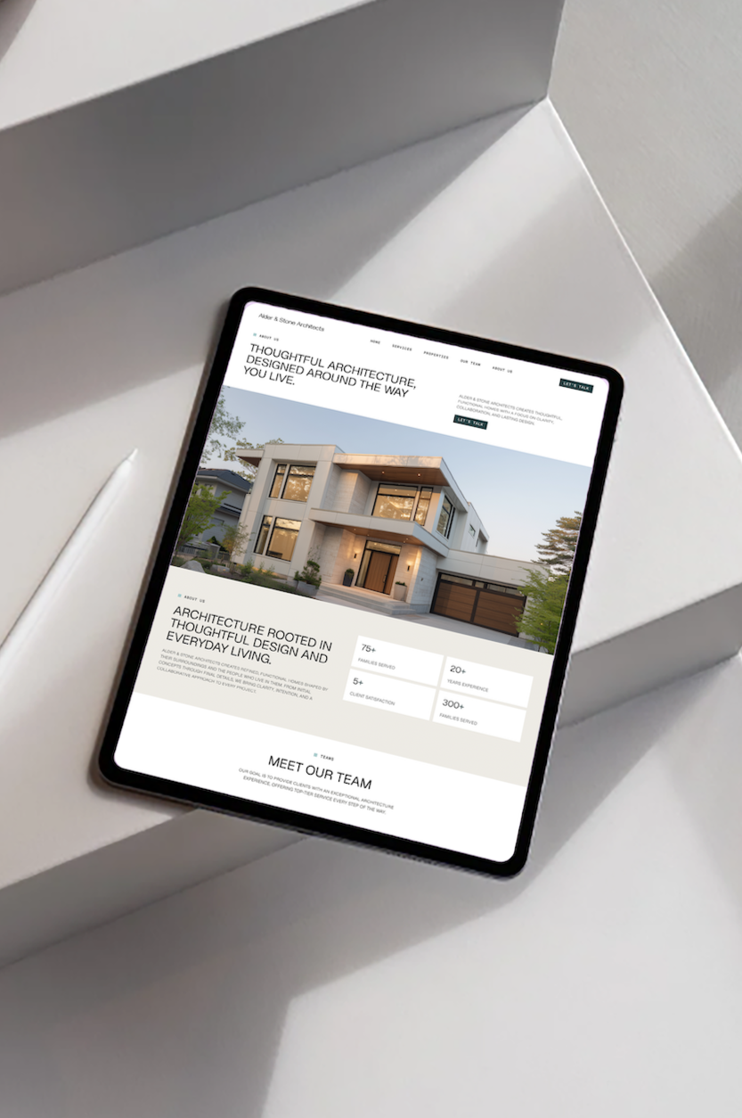
Why Homepage Structure Matters
People do not arrive on your website knowing everything you know about your business. They may have found you through Google, Instagram, a referral, or Pinterest, and they are usually trying to answer a few basic questions very quickly: What do you do? Can you help me? Do I trust you? What should I do next?
Your homepage should answer those questions naturally as someone moves down the page. When it does not, visitors are left piecing the information together themselves. They may have to search through your navigation, open several pages, or guess which service applies to them. Most people are not going to put that much effort into understanding your business.
Your website should make the decision easier.
If your website looks good but still is not turning visitors into inquiries, Why Your Current Website Isn’t Converting goes deeper into the common issues that can get in the way.
The 5 Sections Every Service Business Homepage Needs.
1. A Hero That Immediately Explains What You Do
Your hero is the first section someone sees when they land on your homepage. Its job is not to say everything. Its job is to orient the visitor and make it immediately clear that they are in the right place.
Someone should be able to look at the top of your website and understand what you offer, who it is for, and why it matters. A beautiful headline that says very little may sound creative, but clarity is more useful.
Instead of something vague like Elevate your vision, a service business could say something more specific, like Thoughtful interior design for homes that need to function as beautifully as they look.
A web designer might say, Web design for service businesses ready for a clearer, more professional online presence.
The point is not to make the language boring. You can still have personality. The point is to make sure people do not have to decode what your business actually does.
Your hero should usually include a clear headline, a short supporting statement, and one primary call to action. That is enough to tell someone where they are and give them a reason to keep going.
2. A Section That Names the Problem
Once people understand what you offer, show them that you understand why they are looking for it.
This is where you name the problem they already recognize. You do not need dramatic language or exaggerated pain points. In fact, that usually feels forced. You simply need to reflect the experience they are already having.
For a web designer, that might be: Your business has grown, but your website still looks like the version of your business you started with.
For an architect: You know what you want your home to become, but turning that vision into a buildable plan can feel overwhelming.
For a photographer: You want photographs that feel natural and meaningful, not stiff or overly posed.
When someone reads this section, they should think, Yes, that is exactly where I am.
That recognition matters because it shows that you understand the situation before you start talking about your services. It also creates a natural transition into how you can help.
3. A Clear Overview of Your Services
Once someone understands the problem, show them the ways you can help.
This does not mean putting every package detail, deliverable, price, and service variation directly on the homepage. Your homepage should give people enough information to understand your main offers and quickly recognize which one is relevant to them.
Think of this section as an overview, not the full explanation.
A design studio might introduce Website Design, Brand Design, and Website Support, with a short description of each and a link to learn more. An architect might separate Residential Design, Renovations, and Planning. A photographer might introduce Weddings, Branding, and Family Sessions.
The goal is to help someone understand the different ways they can work with you without making them hunt through the site.
Make each offer clear. Make the path simple.
If this is an area of your website that feels unclear, How to Design a Services Page That Actually Books Clients explains how to structure your service page so people can understand what you offer and feel confident taking the next step.
You can also explore Studio Avia web design services to see how I approach this for service based businesses.
4. Proof That Gives Your Work Context
Good work deserves context.
Showing beautiful work is important, but people also want to understand what it was like to work with you and what your work actually accomplished. That is why your homepage should include some form of proof.
That proof might come from testimonials, project results, before and after examples, years of experience, recognizable clients, or featured projects. The strongest proof usually combines the work itself with the story behind it.
Instead of showing a website mockup with no explanation, tell people what changed. Maybe the old site no longer reflected the quality of the business. Maybe the services were difficult to understand. Maybe the client needed a more professional experience for potential customers.
Now the visitor is not just looking at something attractive. They understand why the project mattered.
Testimonials work the same way. A testimonial that says, We loved working with her, is nice, but a testimonial that explains how the new website helped clients understand the business, increased confidence, or made the company easier to find is much more useful.
Proof gives people a reason to believe you can do what you say you can do.
If you run an architecture firm, this becomes especially important because the quality of your work can be difficult to communicate through images alone. 5 Signs Your Architecture Website Is Costing You Projects goes deeper into the website issues that can make a strong firm look less established than it actually is.
5. One Clear Next Step
Every homepage needs somewhere to go.
By the time someone reaches the end of your page, they should not be wondering what they are supposed to do next. Tell them.
That might be Book a discovery call, Explore web design services, View the portfolio, Request a consultation, or Start your project.
The exact call to action depends on your business, but the principle stays the same. Choose the next step you most want someone to take and make it obvious.
You can have supporting links throughout your site, but your primary call to action should stay consistent. If one button says Get Started, another says Learn More, another says Contact, and another says Work With Me, the experience can start to feel scattered.
A clear website creates momentum. Someone understands the business, sees how you can help, believes you can do the work, and knows exactly where to go next.
What These Sections Look Like on a Real Service Business Website
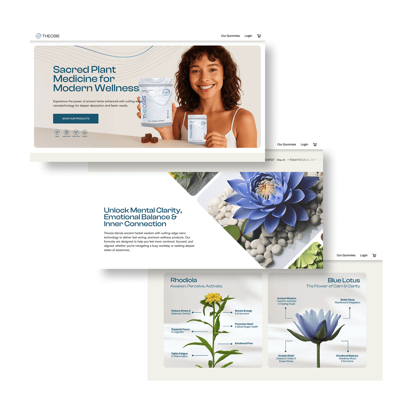
These five sections do not mean every homepage has to look the same.
A website can still feel editorial, bold, minimal, playful, traditional, or highly visual. The structure simply gives the design something to support.
A homepage might begin with a strong headline and a beautiful image. The next section acknowledges the problem the client is dealing with. Then the page introduces the services, follows with a featured project or testimonial, and finishes with a clear invitation to take the next step.
That is a simple journey, and that is the point.
Your website should not feel complicated just because the business behind it is.
A Homepage Should Make Your Business Easier to Understand
One of the biggest mistakes I see on service business websites is trying to make the homepage do too much.
Every detail gets added. Every service gets equal attention. Every possible call to action gets a button. Eventually, the page becomes harder to use because there is too much competing for attention.
I would rather see a homepage with fewer sections that communicate clearly than a long page filled with information that does not help someone make a decision.
Good website design is not about adding more. It is about deciding what matters most.
Your homepage should give someone enough information to understand your business, trust what they are seeing, and feel confident taking the next step. The rest of your website can provide the deeper details.
Your Website Should Support the Business You Have Now
If your homepage feels confusing, outdated, or disconnected from the quality of the work you are doing, you may not need more content. You may need a clearer structure.
At Studio Avia, I design websites for service businesses that need their online presence to better reflect the business behind it. That means looking at the messaging, page structure, services, proof, and overall experience together rather than treating design as decoration.
The goal is a website that feels like your business, makes your value easier to understand, and gives the right people a clear reason to reach out.
Ready for a Website That Better Reflects Your Business?
If your website no longer matches the level of work you are doing, explore web design with Studio Avia and see what a clearer, more intentional online presence could look like.